

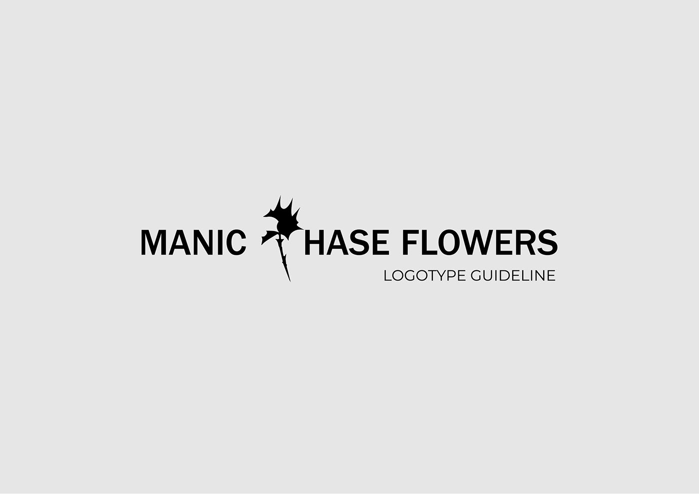
A commercial project born in co-operation with a newly opened flower shop in Warsaw.
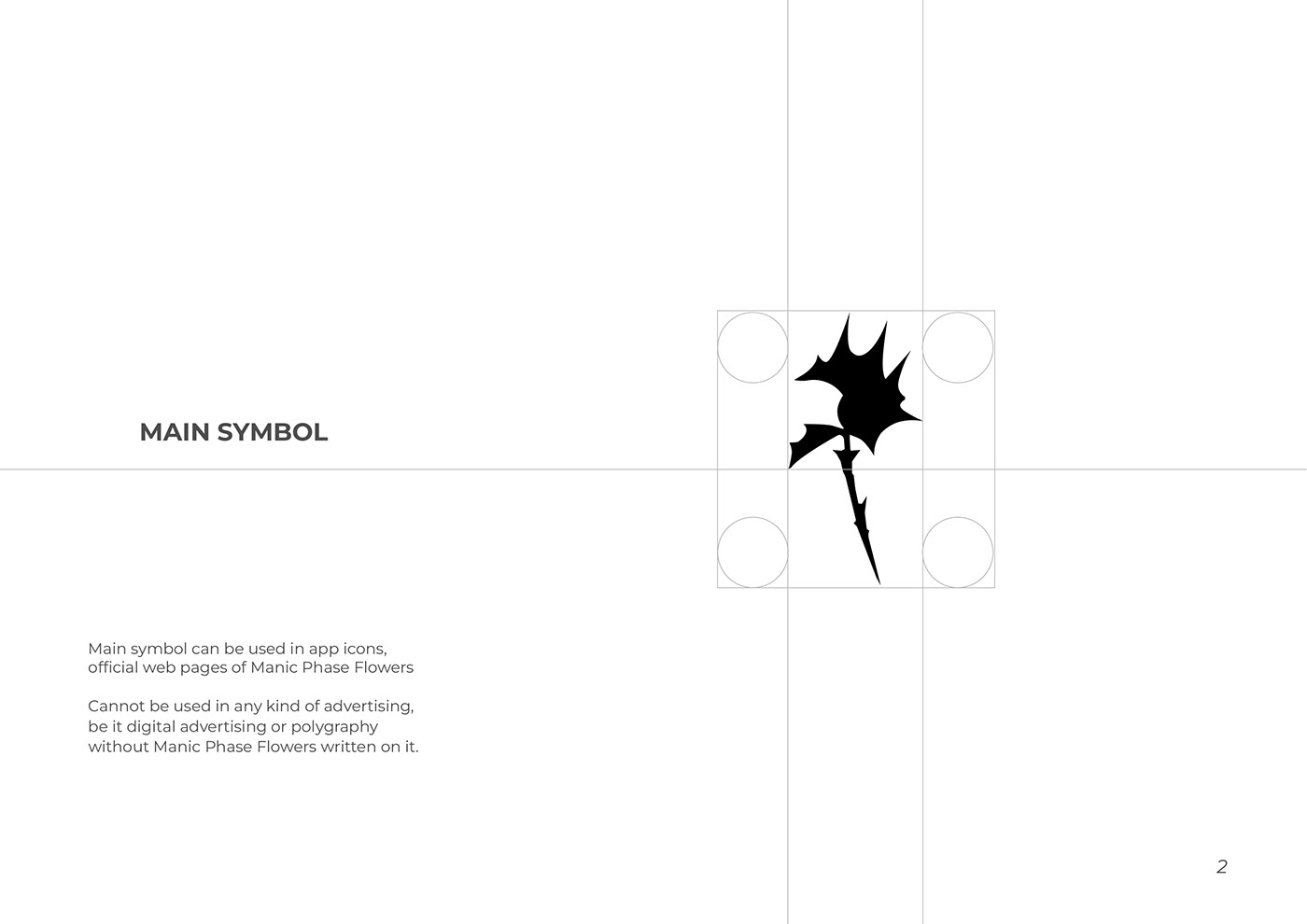
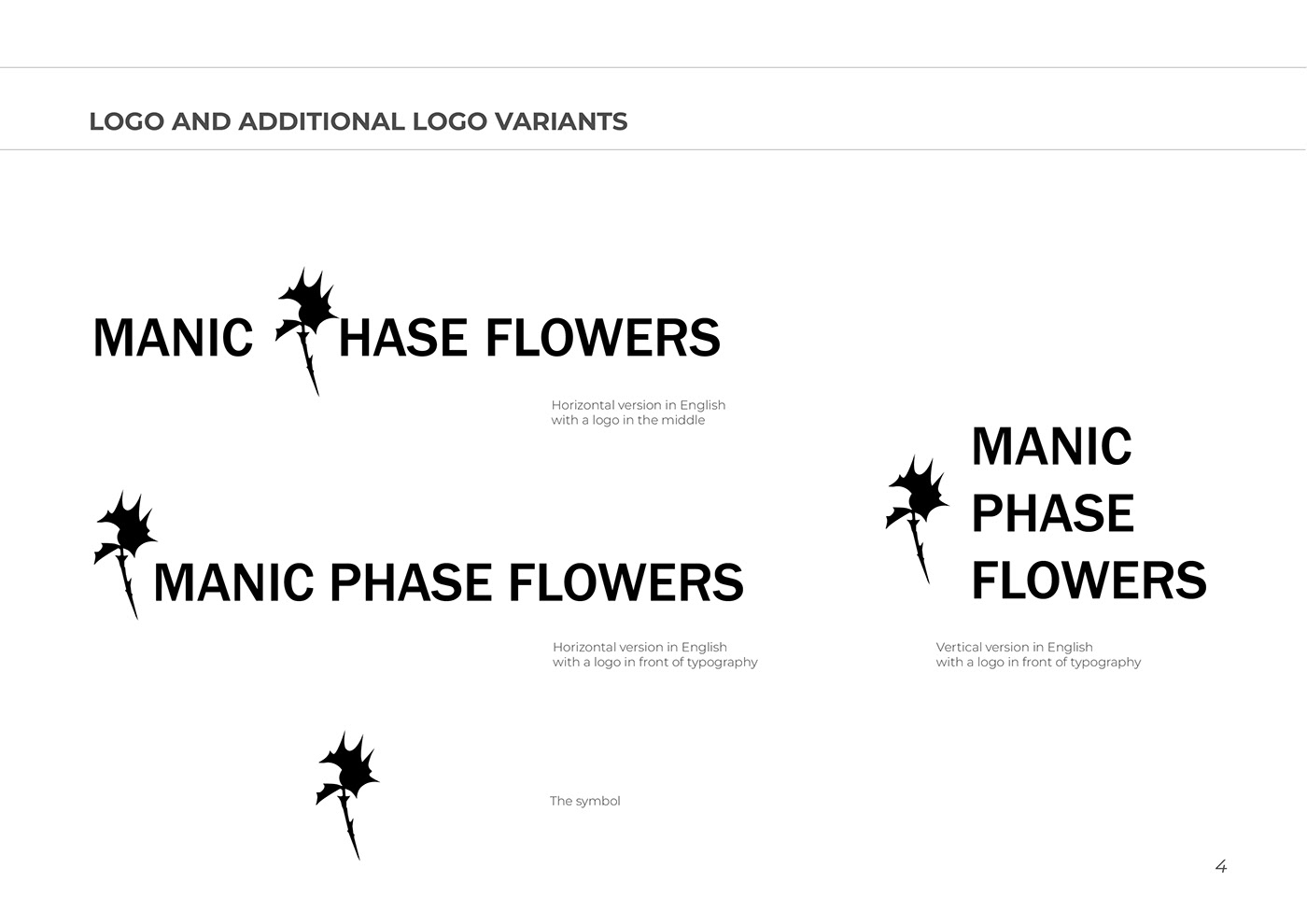
The whole structure of this brand is built on contrasts, between the delicate, complex structure of a flower and the cold hardness of concrete or metal, the contrast of these two opposites.
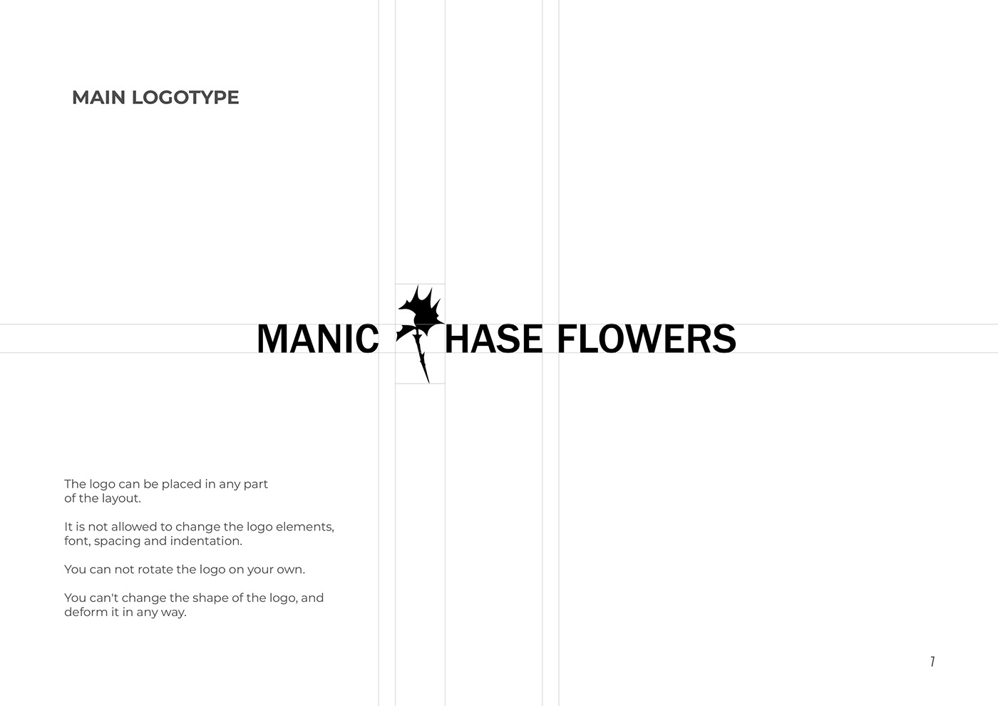
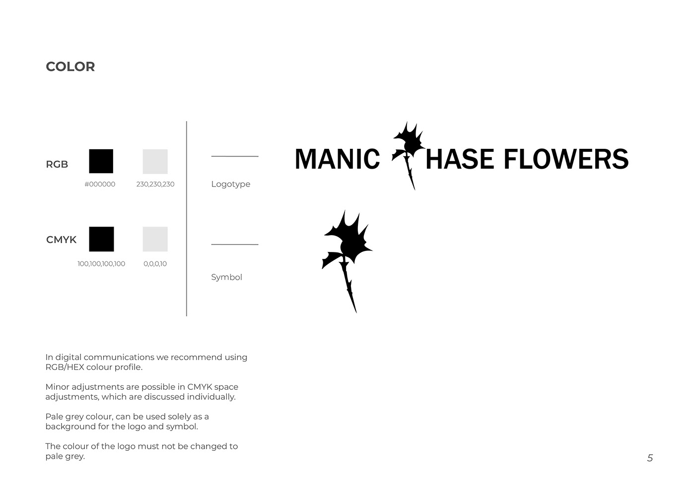
So using that idea i create a comlex logo, with lots of sharp edges which gonna be contrasting with the simplicity of font. The pure grade of colors like white, gray and black helps to increase that clean contrast.


Thank you!
If you would like to contact me, links are below!


